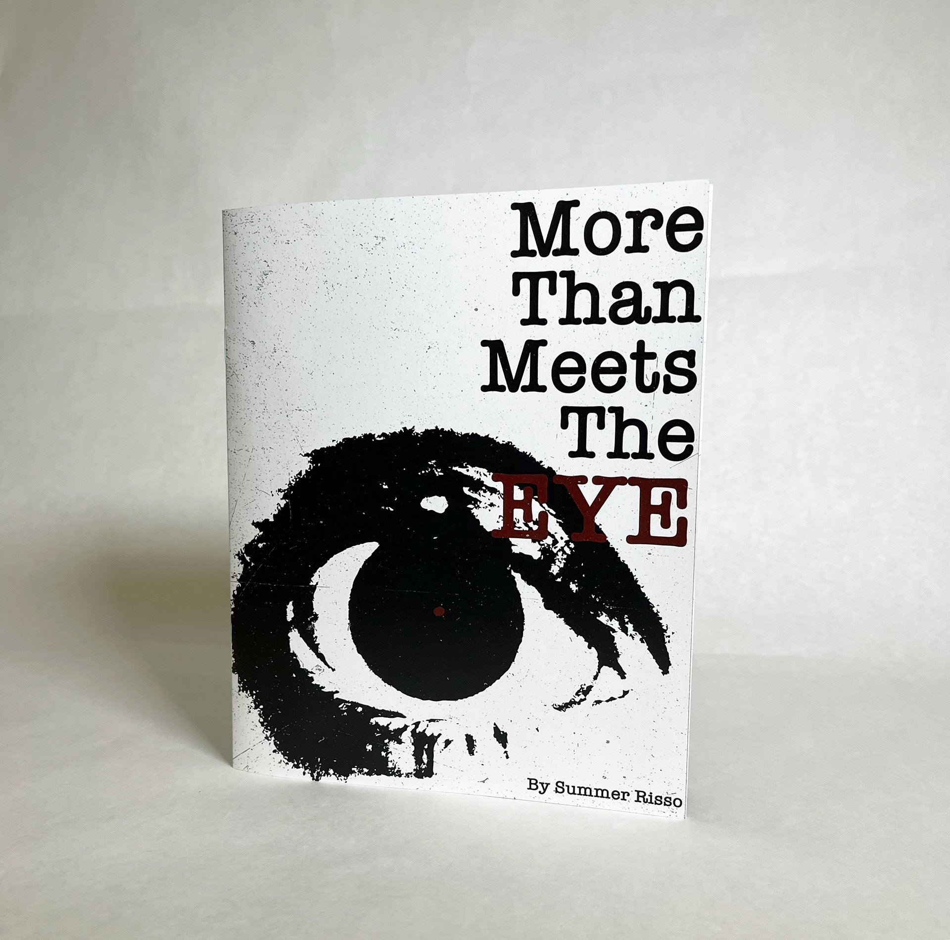
More Than Meets The Eye
Inspired by grunge aesthetic, More Than Meets The Eye explores the essence of good design through visual impact and conceptual depth..
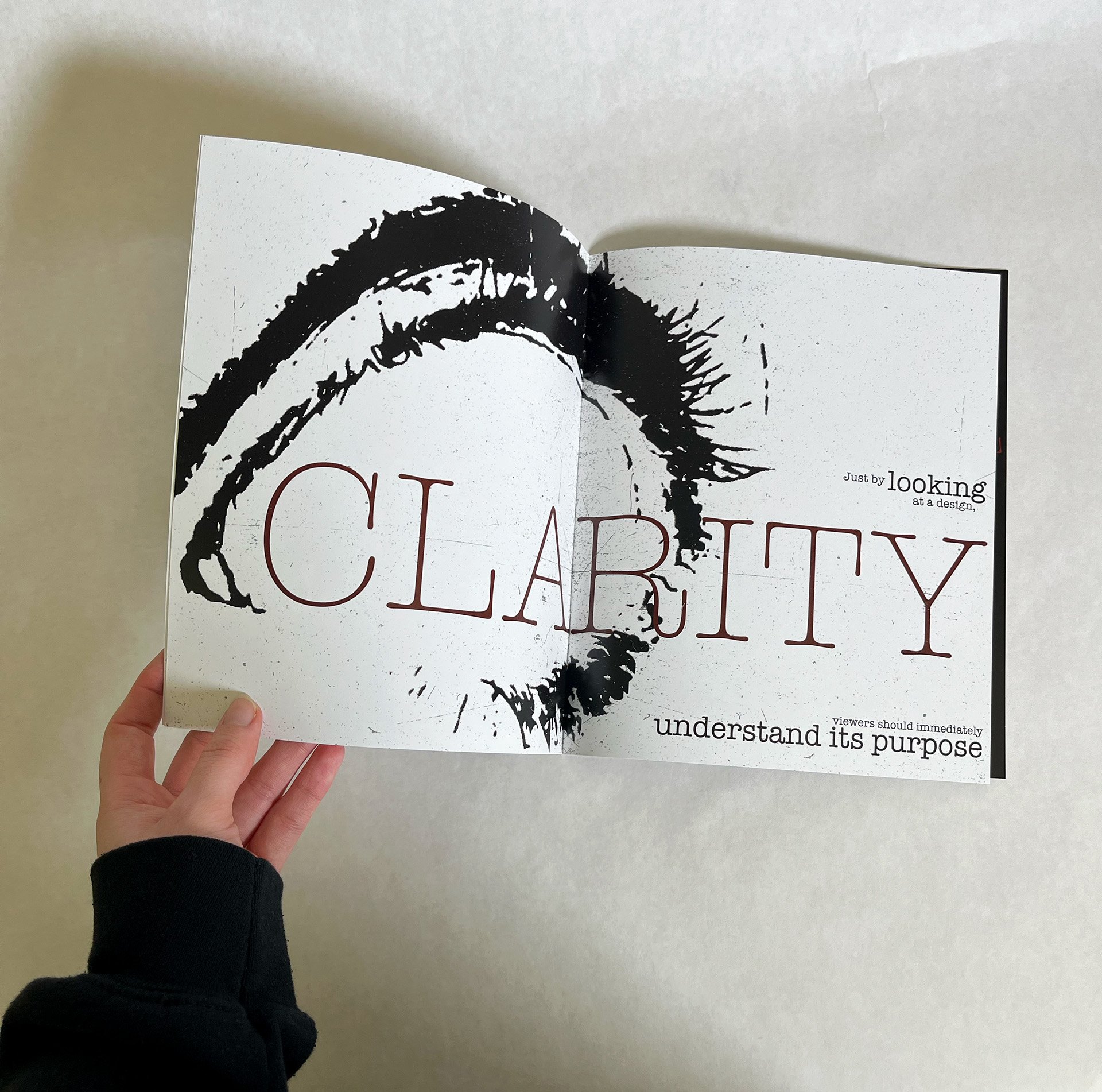
Centering the theme around eyes, a symbol of perception, I wanted to emphasize how design is first and foremost a visual experience. Grunge, with its raw, layered, and emotive qualities, felt like the perfect medium to express this. Since I was new to the style but deeply inspired by it, this project became a personal challenge to grow and push creative boundaries. I chose a limited color palette of black, red, and white to maintain strong contrast, evoke intensity, and reflect the stripped-down nature of grunge. The body copy sections, Connect, Clarity, Functional, Innovation, Timeless, help ground the concept by breaking down key traits of impactful design, showing that good design goes beyond appearance to stir emotion, solve problems, and stand the test of time.

Cover

Spread 1

Spread 2

Spread 3

Spread 4

Spread 5

Back Cover